I was first introduced to the abstract artist through my not so healthy tradition of browsing YouTube at 3 o’clock in the morning. Where as most of the time I regret my choices, one in a blue moon I stumble across something that makes all my nocturnal hours worth while. Whilst doing so recently I stumbled across one video at the end of a network of seemingly meaningless content, one of which led me to the intriguing work of an up and coming creative.
The CBC Arts video followed the creative process of artist Callen Schaub, in the confined proximity of his paint covered studio. As before the free-flowing and one-sided interview even starts we see vivid paints bouncing off and finding home not only on the canvas but also the once white walls. The quick introduction to one of, if not the most distinctive techniques he owns in his work is certainly interesting to say the least. As the rotations quickly transform any one of his pieces into a self-titled display of organic art. With each one of his pieces embodying a unique character, mood and overall emotion if it be through colour, shape or unintentional reference. But what I like most about his canvas based work is how the abstract forms will translate so differently to any viewer, if it be a blazing oil spill, butterfly’s wing or a hybrid selection of two exotic birds that I immediately saw.
Fired Direct Hit
Night Glow
One of my favourite pieces is titled ‘Night Glow’ and like many others is achieved through his ballistic style of paint spinning. What I love most about the piece is the eerie and even borderline sombre mood emitted through the colours and even a surprising level of texture. On first inspections the narrative I obtained was that of someone drowning in a body of water. Through the eyes of the victim we see their vision blurring as the water envelops them, as the luminescent moon fades out of perspective. After simply staring at the piece for a while I develop another self devised theory, with a less macabre tone but rather humorously extraterrestrial. To put it plain and simple the glowing light that steals your gaze is that of a UFOs beam surrounding you before your lifted off of your feet and further into the night sky. ultimately the title could reflect a literal translation of a one of the more prehistoric and original forms of light in the sky, this being a traveling comet. The core of the central light being the comet itself as the surrounding glow bleeds out and shows its path and direction of travel into the ombre sky that is delicately dotted with stars.
NEON RIGHTS
SPIROGRAPHIC
MOVEMENT OF COLOUR I
Moving outside the realm of the ‘traditional’ canvas, Callen has recently collaborated with fashion photographer, Stef Eleoff and produced an experimental series of images that explore the potential of the human form. An eternal source of inspiration for art and creatives, we are more commonly painted onto boards than to serve as the covered surface. In this case skin is covered my paint applied in the varying techniques and processed developed and practised by Callen in his original work. The collaborator and photographer, Stef Eleoff then captures the living canvases not only in the aftermath of application but even in the process itself. As paint gets poured down onto the awaiting models what we are given are images packed with a kinetic energy that we can only imagine in movement for ourselves and later how the paint melts into the natural contours of the body. The series still embodies his identity as an artist, whilst it holds a valuable experimental experience for how far he can take the processes he has created and so successfully owned but yet I believe not yet mastered but I believe will do with time.
I had been looking forward to the latest release from esteemed director, Luc Besson for what seemed like a never-ending wait over the course of what was only a few months. His most recent film mostly commonly referred to as Valerian, adds to extensive and highly admired body of work , made up of over 50 films to date. With his most well-known being the ‘Taken’ franchise, ‘The Fifth Element’ and ‘Lucy’. It begs no great surprise that I would have been so enveloped and eager for its approaching release the first trailer I saw, as his 1997 sic-fi classic ‘The Fifth Element’ is one of my all time favourites. The similar core theme of creatively stimulating visuals and unexplainable vision through one persons eyes had me hooked and counting down the days till I could see it for myself.
The lead up to the film was filled with opposing opinions to my own expectations, as critics has labelled it an immediate ‘flop’. With the blame for many lackluster fueled reviews being put upon everything from the casting choices to the lack of knowledge behind the actual origin of the film’s content. The trailers themselves were in the line of fire, as they didn’t actually set up the plot for the viewer but more so distracted them with impressive visual imagery. But as a predominantly visually driven person, the trailers layered shots were what led me to want to watch the film as badly as I did. In terms of promotional strategy however, one of the biggest mistakes was made that impacted on the its reception. The release date didn’t take into consideration what would be the films main competition in a time of some significant releases. problematically the film was less than smartly released on the same day as the highly anticipated WWII film, ‘Dunkirk’. With a considerable more serious undertone obviously for its subject matter, the competitor dominated in comparison. Mainly by bringing in an openly varying audience of a more mature age range all the way down to the curious youth that Valerian probably betted on targeting.
Not one to care about the opinions of others until I see it for myself. I went into the cinema with the same eager excitement I had when I first saw the trailer whilst waiting for another film in the seats of the same cinema. ultimately I wasnt disappointed in the slightest once the credits rolled, with my own opinions opposing those I had been fed by the paid professionals who did their job of sourcing after something small so that they could magnify it for everyone else to see. I was actually pleasantly surprised by the only doubts I had beforehand. This being the uncertain level of acting ability I thought the leading female protagonist, Cara Delavigne would possess in order for me to see her as ‘Agent Laureline’ and globally renowned not a Fashion model. I actually thought she did surprisingly well in comparison to her other major acting role I was underwhelmed by only last year, this being her role as ‘The Enchantress’ in the DC extravaganza that was ‘suicide Squad’. All of the other characters I thought were portrayed successfully by a diverse selection of actors and actresses.
Like ive said numerous times, the visuals of the film were what grabbed my attention and lead my eager curiosity to see what else the film had to hold. After finally seeing it for myself, I wouldn’t be able to name an equally comparable creative universe since the game changing release of Avatar back in 2009. Every aspect of each shot was clearly well-considered and possessed various degrees of development. Both the imaginative locations and the inhabitants that thrived in them each held artistic details that enveloped you into wanting to learn more about them and their world. If it be the peaceful humanoid pearl gathers that occupy a paradise of white sand beaches and crystal clear waters, or the Doghan Daguis translating triplets that hold the information and understanding of over 1,200 alien languages not to mention over 500 computer derived languages.
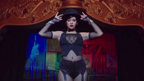
My favourite sector of ‘ALPHA’, a floating melting pot for over 3000 alien species that only continues to grow would be the lesser visited back streets of Paradise Alley. A bustling venue filled with a nightlife like culture that thrives of the exoticism of street performers, merchants and immigrants. The short time that we visit the Vegas like strip, we are shown the unique abilities of a dancer names Bubble. Played by Rihanna, the spacial immigrant is a prisoner to a club owner who exploits her skills as he hides her from authorities. Through her true to life desperation, she stays until Valerian comes along and with her help he promises to set her free. My favourite scene is when we finally see her metamorphic abilities in play as she dances for the agent whose to transfixed to even sip his complimentary cocktils…that is before its whipped out of her hands by the then cat eared alien before she performers aerial acrobatics. The whole scene is a feast for the eyes as I for one was intrigued to see what her next costume and character would be, from a latex red-haired nurse to a pig tailed school girl she plays with the guilty pleasures and even fetishes of many and even though the film is aimed at a primarily young audience it still possess mature themes that are subtly hidden behind captivating imagery.
I for one could spend hours researching into any species laying home on ALPHA and I hope that Besson follows in the same footsteps as James Cameron who even after Avatar, produced illustrative journals to the other worldly creatures that populate the universe held within both his mind and the big screen. The film overall was a well deserved watch from myself and I hope many others choose to follow their own desire to see it for themselves and not solely the put off impressions provided by critics. As time goes on I will look forward to the opportunity to not only see the film again, but also to learn more about it. I would of course recommend a visit to the world of Bessons imagination as you follow agent Valerian and Laureline across the galaxy on their fast paced adventures.
It was around this time last year where my first week of university introduced me to what would soon become my latest unexpected obsession. Taking part in a treasure hunt alongside my fellow classmates, we explored the city of Nottingham in search for the local hotspots. Provided with cryptic clues we worked together to source out the hidden gems of the city, but even with our phones at our disposable it was still a challenge nonetheless. Designed to act as a much-needed icebreaker, it certainly did so as we discovered places we would quickly come to love and visit as often as we could. For me my favourite place to visit to this day is ‘Ideas on paper‘, a quaint shop hidden down an alley off one of the busy city streets. Little did I know that this shop would soon become my regular go-to for the latest that the fashion publication industry had to offer.
I had never really explored or paid much attention to magazines, even ones related to fashion did interest me but not to the point that I would go out of my way to hunt them down as I now do. I quickly found myself having built up a collection of my own of over 30 to date, some of which having to have been sent over from China and South Korea. By keeping up to date with the publications via Instagram, I can closely follow the upcoming releases, with no current intention to stop adding to my ever-growing collection.
What I enjoy most is physically buying the magazine ive been searching for in person. Having to resort to order it online only if I have to due to it being a rare issue or if I can’t actually find it in a store. One of my other favourite shops to visit can be found in the heart of the urban jungle that is Manchester. The glossy red front of Magma, is a perfect home to a unique selection of magazines that are seemingly more difficult to find in mainstream shops such as your WHSmith or Waterstones. With it being unnatural for me now to leave without a purchase, even if I went in with no specific intentions or particular magazine in my mind. This is however what happened on my most recent trip whilst in the city, when I came across a magazine I had unwillingly gave up on the idea of getting.
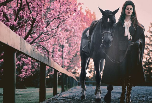
V108, Americana issue, Lana Del Rey cover shot by Steven Klein
The magazine in question was the Americana issue from V magazine, with the V108 cover featuring the etherial Lana Del Rey. As a fan of the indie pop singer since her debut days of Born to Die, I was instantly transfixed by her bewitching stare. As an added incentive I almost immediately could sense the signatures of Steven Klein in the thick smoke-filled air of the shoot. As an equally if not longer follower of his work over Lana, my adoration for his career would only make me more willing to obtain the magazine on its release. The only problem I encountered when it came to pre-ordering the cover itself. As I had rarely came across a V magazine in any store, I thought the best route to go down would be to preorder from the official website. However soon enough my plan was put on halt, as at the checkout the standard price of the £7.50 quickly rose up to the £40 mark thanks to international shipping costs. This led me to put off any hopes of getting the cover as I couldn’t bring myself to pay the price, that I would only ever pay for an archived cover and not one that hadn’t even been released yet. Thanks to a quick trip to Magma however, I surprisingly came across numerous copies of the cover that once seemed to difficult to obtain and I left a happy customer.
When I finally got my hands on the magazine, the editorial within was just as captivating as the striking front. The shoot holds a strong presence and melancholic mood that perfectly suits the style of the featured leading lady. A guest appearance however takes the series of photo down an equestrian route, as a midnight black stallion accompanies Lana in some of the photos which turn out to be some of my favourites. The country theme is brought out even more through knee-high leather riding boots, textured tweed and a firmly gripped riding crop. Out of the all the domineering looks that the songbird adorns, my clear favourite would have to be the worn on the cover. A tweed Ralph Lauren jacket with structured shoulders added a masculine hardness to the look, only exaggerated by a corset like Balmain belt that lay cinched around her waist over said jacket. The overall look is undoubtedly empowering which im sure Lana felt as she embodied the character she played on the scenic set.
Even though the issue is centre around an evident patriotism to the United States, I can’t help but see references to European militancy through the sharply cut shoulders made out of an almost khaki green herringbone tweed. However knowing of Lana and her strong-minded opinions on the current state of America, the shoot feels undeniably symbolic to her opposing stance against the recently elected President. The military visuals and nostalgic americana references almost seem as a public stand against him, in a time where the people are divided even in a time where the world cannot simply afford to be.
This slideshow requires JavaScript.
Putting the political messages aside, the cover and accompanying editorial are inexplicably beautiful. With the relationship between the photogenic subject and the photographer, being clearly reflected in the images that were produced. The piece can only be described as ‘strong’, in the sense of its physical visuals all the way through to the overpowering atmosphere of each shot and its present cryptic narrative. I’m certainly glad I decided to stop by the little red shop whilst passing through the city, as if I didn’t I wouldn’t be able to proudly have the powerful cover in my collection.
One of my favourite pastimes is to browse the resourceful online archives of SHOWstudios, with the YouTube channel being ultimately my most favoured one that I eagerly await upon. The award-winning website was founded in the midst of the year 2000 and is directed by the renowned Fashion Photographer, Nick Knight. A central hub for the communication of the fashion industry online, it acts as a constantly updated source of opinion, history and knowledge.
I am left puzzled when learning in conversation that a fellow classmate hasn’t delved themselves into what SHOWstudios has to offer. Even thought it comes as a questionable surprise to me personally, I quickly learnt that this lack of knowledge boils down to the two dominating intentions many have. The two types of people ive come across on the course reflects itself in the duality of the title itself. Those interested in the business and marketing side of the course are reflected in the ‘Promotion’ aspect. Whereas those who have a deeper interest and affiliation to fashion itself are more so drawn to and kept under the umbrella of the ‘Communication’ side. Either way which ever side someone predominantly leans towards, gaining a further understanding of the industry itself in terms of the runway shows and the history behind the designers, houses, collections and any one of the numerous creatives that lend their talents in some way will defiantly benefit them in the long-run.
My favoured series at the moment is titled ‘Head To Head’ and it delivers just that depending on the featured company present at the table. As acting host Mimma Viglezio, a Creative Consultant and Writer leads the one-to-one conversation with a guest that focuses on a particular show from that years season. This posts main body will feed off of a recently uploaded episode of the series that featured Mimma, alongside Stephen Jones a celebrated creative in the field of millinery. The video centres specifically around the week of A/W 2017 Haute Couture and features some of the most talked about shows that certainly draw out split opinions from the two. With my own thoughts being offered up on the same shows that they discuss, my favourite piece from the collections will be present alongside brief attention to the accompanying sets of each.
Valentino, Look 1
The first show that was talked about held high praises from both commentators and equally so from myself. This being the lux collection produced by Pierpaolo Piccioli for senior Italian house, Valentino. I had always deemed the brands identity too ‘traditional’ in the sense of its more favoured mature image, however in the more recent collections my views have started to shift and even more so thanks to this show. The entire collection embodied the essence of Haute Couture, as it clearly displayed an impressive level of impeccable skill and craftsmanship.
I particularly favoured the colour blocked pairings more so than the printed pieces, as they held a certain level of youth which opposed my initial opinions on the brand itself. With my favourite look opening the show it set the tone for what was about to follow swiftly behind. What sold me about it was the combination of pink hues that made each of the multiple fabrics showcasing their quality and their individual textures. The surrounding set was a simple layout of muted pink walls, with glass droplet chandeliers and monoliths of dripping wax. The set complimented the collection, as it shared similar colours to those present within the clothes, as well as it mirroring the same youthful sophistication of each look that walked the halls.
The second show held close significance to guest Stephen Jones, who worked on the hats present within the collection. This being only the second Couture show that the rather recently appointed Maria Grazia has done in her position of Creative Director. The designer who before her significant appointment, made up one half of the Creative for Valentino alongside the now equally solo, Pierpaolo Piccioli. The collection itself paid homage to the founder ‘Mr Dior’, through the use of his silhouettes that were used as the base for her new designs. I personally thought it was the perfect way to commemorate his work, to use his originals if they be an evening gown that now takes form as an equally chic floor length wool coat.
Dior, Look 28
When choosing my favourite piece from the collection, I had to agree whole heartedly with Mimma. As the coat and skirt combo she chose had its own individuality against other looks which shared fabrics, details or colour. We learn that a richly coloured ‘patchwork’ coat in soft velvet, was actually hand painted instead of the presumed construction method both Mimma and myself first thought. But what makes the look so distinctive is that the closed coats length, cut just below the knee enables the energetic feather made skirt to show. What makes the look so unique is the juxtaposition achieved between the rich outerwear and the contrasting light skirt, even though they both share the same 18th Century colour palette if it be in block or an ombre. In most collection there is always a stand out piece/look that when it first turns the corners to make its debut, it will steal your gaze more so than any other that came before or even following after. To me this pairing and even more specifically the coat is that piece for me within this cultured collection.
Even though I agreed with the two about the stand out look that was the ensemble above. I had to disagree with their glazed over bewilderment when it came to what I thought to be a rather impressive set. The outdoor surroundings were composed of flora that lay cover for the numerous sculptural animals that filled the set. Ranging from a family of giraffes to a proud standing lion, all the way to an eagle that appears as if it’s swooping down right onto the runway. What I didn’t understand was how the two could not find the link between the clothes and the surroundings. The clear theme of exploration and travel, wasnt just seen through the clothes but quite literally spoken about my Stephen. As he goes into how Mr Dior loved to showcase collection across the world, from New Zealand to Cuba. Acting as a celebration of his work it seems only fitting for his history and love of travel to be included within the most recent collection.
When it came to the third show I myself was torn between the contrasting opinions of both Mimma and Stephen. Thanks to Karl we get ourselves some opposing thoughts that im sure aren’t just shared between the two and myself, when it comes to the work of Chanel. Never failing to not be one of, if not the most talked about shows by both the press and civilians alike. This time Karl decided to go bigger than ever before and certainly more so than his rocket ship stunt for the brands Fall 2017 R-T-W collection only a few months prior. Alongside the couture clothes of Chanel, a near full-scale replica of one of the most important landmarks and pieces of architecture to not only Paris, France but the world was present. Not far from the real one, a second Eiffel tower stood looming over the girls as they walked the runway, so much so that the top was lost in a sea of fog like clouds. The collection to me however didn’t come close to being as surprising or actually as interesting as the surrounding set. Once again we were given 60+ looks made up of tweed and wool jackets with a few dresses thrown in for good measure. To me at least I have difficulties distinguishing collection without having to refer back to the accompanying stunts or backdrops. This being simply due to the fact that what we know as Chanel is what is continues to come down the runway season after season with not much change.
Chanel, Look 53
One of the few pieces I actually was excited to come across was that of a simple mini dress with no tween present. The off white pearlescent fabric of the dress protruded out in the form of a wrapped bow. Which cleverly ballooned out to make up the skirt, whilst it flatteringly finished around the bust before being tucked in at the tightened waist. The dress being finished off with the same style mini bowler hat that all the other models adorned in a matte black, was paired with a pair of thigh high boots that found their way up into the dress itself. What I liked most was the contrasting properties of each piece against one another. Whether it be the matte of the hat against the lustrous sheen of the dress, or the black vinyl boots with the softer pink hidden on the lining of the tied bow. The entire look was the most modern in my eyes and held an adored sense of playfulness and youth that seemingly was lost in more than half of the other looks.
I’ve already touched upon the magnificence of the scenic surroundings, but yet it brings questions to the agenda Karl has for the brand. I side with Mimma in the sense of its testing miss use of resources and money, but the fact is that like she says people look forward to the featured stunts more so than the designs themselves. I think it was the perfect way to celebrate the City of Paris, but was its grandeur really necessary when the real one was only a short while away and acts as the true symbol for the country and City in question. I also like the idea of the audience looking like pedestrians simply and naturally being seated enjoying a persian day, as luxuriously dressed models walk on by. However Stephen raised an important thought on if we should simply appreciate what Karl presents for us no matter how theatrical it may be, because one day down the line we wont have Karl to gift us the spectacles he has done so many times at Chanel.
The penultimate collection was courtesy of the pioneering designer, Iris van Herpen. A true vanguard of the industry, her technological infused designs leave audiences in awe due to their sheer perplexing design and execution. From the exploration into 3D printing to the mimicking of water crashing against the human body, her work is solely her own freshly plucked from her ever astonishing capability in the realm of science, engineering and ultimately design. This collection focused once again on water but in a less so literal sense, compared to some of her past work. Now with the added element of air, her pieces embodied the fluid movement that both have the potential to generate. A forward thinking artist of our time, Iris will continue to amaze due to the equally as growing advancements in technology in which she fuses both herself and her visions with.
Iris van Herpen, Look 11
In a considerably intimate sized collection in comparison to the previous work of Karl, only 18 looks walked the show and each one was as captivating as the next. Showing a range of techniques from pleating to laser cutting, skin-tight mini dresses were just as detailed as voluminously structured kimono coat/capes. But out of all the sculptural looks, one of the ‘simpler’ pieces was my running favourite, this being an above the knee dress with long sleeves and a high collar. When in motion the delicate laser cut pieces shift and posses a complicated depth, through the metallic quality fo the fabric reflecting every angle of light coming into contact with it. Paired solely with a simple black ankle strap heel, the focus of your gaze is put wholeheartedly into understanding the dress and its construction. When I first saw the look come out however I was reminded of a famous McQueen corset, from the Fall 1999 collection, ‘The Overlook’. The corset was made up moulded metal coils that encapsulate and restrict the female form, which gained attention from many for its extreme design. The comparison doesnt undermine Iris as the more time you spend looking at her dress, the more evident that is completely reflects her distinctive identity that she owns as a designer.
The equally minimal set reflected the underlining theme of the entire collection, whilst featuring a literal sense that enhanced the subtly found in the clothes. Encased in boxes of water, musicians part of the group ‘Between Music’ played their instruments whilst being fully submerged. A range of instruments from violins to the naturally produced vocals courtesy of the singing member, who has been perfecting her breathing techniques for years in order to produce the sounds through a stored air bubble in her throat. The sight of the members suspended within the water adds an eerily uncomfortable atmosphere to the show. With the water having a green hue that clouds the figures identities, my first thought was to that of the recently released film, A cure for wellness. Ideas of medical labs and even extraterrestrial narratives came to mind, with the designs acting as the final outcomes of a clearly succesful experiment into the realm of nature, science and the human body.
The grande finale of the panel focuses on a collection from John Galliano as creative head of luxury french fashion house, Maison Margiela. Having been appointed as Creative Director in the still recent year of 2014, John has been exploring the possibilities that are on offer with the platform of Margiela at his disposal when it comes to his own creative visions. Through this collection I feel that he has finally found a level of comfort in himself once more as a designer. Even though it’s not his founded label he respects the house, through his inclusion of quintessential elements that the brand is known for. In this show it was the dominating use of mixed fabrics and deconstruction that was evident throughout. With it being one of if not the most significant technique of the brand, it held an enriching level of Galliano-esque flare that has been missed. The collection itself was built around a beloved essential for many, the humble trench coat. The story of how this came to be is rather a humorous one but it goes to show how the simplest of moments can lead to so much more. As John throws an old trench on to take the dog outside, unexpectedly he bumps into some friends and decided to go out with them whilst still wearing just the trench he found on his way out.
Maison Margiela, Look 5
Unlike some of the collections ive talked about in this post, this one was the hardest for me to pick from when it come to my favourite. In the end it was a trench coat that stole my heart, however it comes to no great surprise that it isn’t just your average trench. A shear nude fabric makes up the entirety of the coat buckle and all, that lays over the top of a patterned knit and flashy gold boot. The overall look feels like a developed take on a seemingly common look worn in bitter air of the years later months. As many trenches come in muted colours that include a beige based nude, the sheer factor adds a lightness that works well with the chunkier piece on show underneath. The see through coat could be in reference to the gesture of women wearing nothing but a belted coat as they go surprise their lover at the office. If so it wouldn’t come to much of a surprise as John has never been shy of adding a little sex appeal and risqué elements to his work and clearly so even at Margiela.
The final location of the show was actually a last-minute decision due to unforseen circumstances. It however would only work in the brands favour as in the end it felt only fitting. This being as the collection was shown in the brands infamous design headquarters. The minimalistic white surroundings bought the clothes out even more so that the former venue ever could. Wherever it may have been, it wouldn’t have the same impact as seeing the clothes walk the halls in which they were painstaking designed and put together in. It felt incredibly natural and fitting for them to be shown there, some would even call it fate. The entire show held a overwhelming urgency of modern-day glamour, with an artistic sculptural quality I am only happy to admire. The intimate nature of the small-scale collection meant the rather personal attention to each piece was felt as they deservedly walked the room and onto the camera role of everyone there.
The once industrial rich City of Manchester has to be my favourite place to spend time, even it be for just a day. A hotspot for creatives, both artists and musicians alike thrive within the urban jungle of a City, with it being evidently clear why after spending time walking through any one of the streets. My first time visiting last year led me to discover a single place celebrating youth culture, as well as a multitude of sub-cultures and clans using the city as their own personal playground.
Having just spent a week in the City, a whole 7 days were filled with the freedom to explore what I had yet to see. The time in which I chose to visit couldn’t have worked out any better either. Whilst watching once of the recent panel discussions from Show Studios, the leading host Lou Stoppard mentioned a newly opened exhibition in the City as they discussed the latest collection from Raf Simons. The exhibition in question is a celebration for the famous art director, Peter Saville. The respected graphic designer and the one responsible for creating the iconic jacket covers for the band Joy Division. Held in his hometown, the curated exhibition featured his work with musicians through album covers, posters and also his most notable collaborations into the fashion industry.
When entering the exhibition held in the Manchester Art Gallery, the room was immediately felt different in the sense of its contrastingly gritty feel to the rest of the gallery. The lights were dim with spotlights hitting his work throughout and some even being framed by hanging fluorescent tubes. With one of those being framed by the sculptural light installation immediately catching my eye. This being the reason I was so interested in the exhibition, a Raf Simons parka from his fall winter 2003 menswear collection. The coats closed the show as four models showed of the individual printed backs, featuring images created by Peter Saville himself. Now the rare items were the star attraction once again, as they celebrated the collaboration between the two artists.
The range of parkas remain some of Rafs most sort after pieces by his cult like following, with many treasuring them in their archive like wardrobes. These coats came back into the scene again not so long ago, as 3 of them were placed on the second-hand designer fashion selling site, Grailed in 2016. Each marked at a cool $20,000 the significant pieces gained coverage due to the designers still sore vacation from Dior. Even now in his most recent menswear collection, the two worked alongside each other once again to give us printed tees, smock like bibs and even paper lanterns that refer to the designers background in industrial design. In both their respected fields of fashion and design, the two are highly decorated and equally as respected by their peers and their followings.
Even though my goal was to see the coats for myself, as I explored the room it was hard not to look onto his other work without admiration. A cased wall displayed a selection of his most famous album cover work, from simple typographic based pieces to contrasting flame covered beach scenes. Another feature of the room was that of a large white block installation which was impressive just for its sheer size and simplicity. The connecting blocks had single detail of typography plastered on each side of the cubes, words included “ACDC”, “JOY DIVISION”, and “Love will tear us apart”, all of which reference his collaborations and career.
Having the chance to see an archived piece from Raf Simons was an incredible experience, as a fan of his work and for what he has done in terms of menswear over the span of his ever conquering career. The other work from Peter Saville was even more impressive in person, since I had only seen them in a flat 2D from on a screen. Being able to see them made me appreciate his art work on the album covers specifically, as they each possessed their own personality with his combination of imagery, colour and typography being so perfectly balance. The exhibition even it terms of its layout and design overall was aesthetically succesful as it only enhanced the work it framed and perfectly reflected the style and career of who it was celebrating.
If you’re a follower of Peter Savilles work, a fan of Raf or simply in the City visiting, I would definitely recommend a trip to the exhibition. Open daily 10am–5pm, Thursdays 10am–9pm, the exhibition will be held there until Sunday 3rd September 2017 so go whilst you still can.
“This is our world now…the world of the electron and the switch…We exist without skin color, without nationality, without religious bias…and you call us criminals. Yes, I am a criminal. My crime is that of curiosity.”
Bringing attention to the underground world of hacking, the film follows one notorious individual along side his friends and fellow hackers in an age of rising technology. Firstly set in 1988 we meet a young hacker being arrested and tried for crashing 1,507 computers and drastically affecting the New York Stock Exchange in one day. At only age 11, the criminal prodigy going under the name of “Zero Cool” a.k.a Dade Murphy is a talented yet problematic kid who’s mistakes would soon catch up with him and be punished for the next 7 years. After his family faces a fine of $45,000 ($91,300 in today’s economy), he also is given a ban from using computers or touch-tone telephones until he reaches the age of 18.
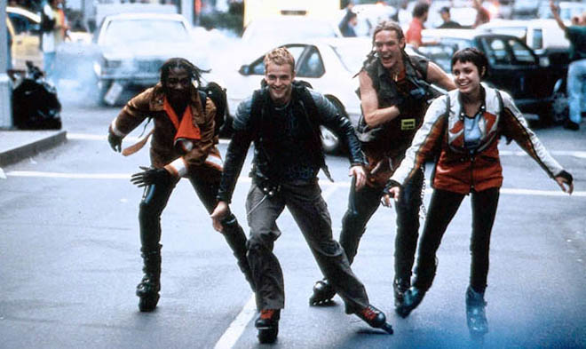
Left to Right, “Lord Nikon”, Joey, “The Phantom Phreak”, “Cereal Killer”, “Acid Burn”, “Zero Cool” / “Crash Override”
Joining him on his birthday, the newly named “Crash Override” returns to his hobby of hacking and whilst doing so he makes the wrong decision in crossing another’s cyber turf. As well as starting his new online life under his secondary alias, he also has the joy of starting at a new school. Eventually making friends with a group of hackers, he comes face to face with his online rival “Acid Burn”. Their rivalry soon takes form in a ‘hack off’ to find out who’s the better online criminal. By each performing tasks that target “hacker enemy #1”, Secret Service Agent Richard Gill, they cancel his bank cards and even pronounce him dead on his public records in order to prove their talent. Their little contest is put on halt as some of their friends find themselves behind bars for something they haven’t in done. Being accused of launching an ecologically destructive virus within a million dollar company, they need to put their proven skills towards finding the real culprit and stopping them before they are instead found guilty.
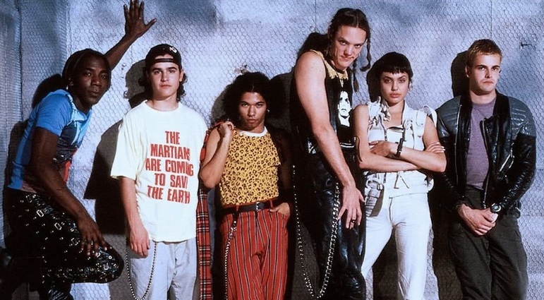
The first time I watched this film I instantly was transfixed by one thing in particular, the fashion. It was hard not to look at each piece the characters wore as quickly as you could, simply because what they wear is something we don’t see on the streets today. With it being set in the mid 90s a lot passed within certain boundaries that just isn’t now. In a time heavily influence by music, both grunge and rave attire was incredibly popular amongst teens and young adults. With staple pieces such as orange lined bombers, harness like belts and skin-tight long-sleeved t-shirts being adorned by men and women alike, thanks to the late trendsetter Gianna Versace.
One of the biggest trend of the time being crop tops, now an item in many girls wardrobes they were originally worn by men. Originating from an unlikely place, the gym was the break through platform for crop tops as a result of bans due to gym intimidation. Avid gym lovers were asked to not workout or walk around the gym shirtless and as a way of getting around the ban they cut their sports tops in order to still be able to show off and see their bodies as they worked on them. Since then they have been adopted as a popular fashion item, with them having blown up in the early 2000s and more recently in the last few years by teens.
This slideshow requires JavaScript.
Kid Cudi, Coachella, 2014
Today it is less common to see a guy walking into a club sporting a crop top, especially for any straight guy. With its origin being lost, the once popular item worn by both men and women alike is now solely targeted towards females. The stigma now is that they demasculinize a man when they were originally designed to enhance their bodies. With a fear having grown ever since the late 90s, men now are uncomfortable with the idea of touching clothing labeled with opposite sex as it questions gender roles and whats acceptable through the eyes of others. Who knew that the meaning of a single item as simple as a cropped t-shirt could posses such a complex level of understanding and power over the genders in our society today. With that being said they have recently gained attention through many male celebrities known for their “masculine” characters wearing them on sets of films, whilst performing at festivals or simply walking down the street with friends.
With a near all male cast the only significant female role is that of Kate Libby / “Acid Burn”, played by a young Angelina Jolie. The quickly formed rival to the leading male protagonist, she demonstrates her talent and what it takes to call yourself ‘elite’. As equally gifted in the knowledge of the cyber world she can hold her own not only on a computer but in the real world against anyone who opposes her, due to her ferociously ballsy confidence. The one other thing she posses is a cultured and eclectic wardrobe. Whilst still fitting in to the cyberpunk scene of the times, her looks still show off her own distinctive style and personality. With a particular fascination with oriental culture, she expresses her appreciation through kabuki style makeup, mini kimono wrap dresses and structured harnessed jacket/vests in a bold royal red.
Some of the pieces she wears throughout are still available today due to their purpose as practical wear within their relation to sports. One of which being an aqua colour scuba top designed to prevent rashes caused through wearing wetsuits whilst out surfing. The ‘All Time Short Sleeve Rash Tank‘ in ‘BLUE DANUBE’ by Quicksilver is worn underneath what I believe to be a red and white leather Suzuki jacket in various scenes, whilst still being available on their official US website for the price of $30.00 (not to bad to look one step closer to Angelina or that of a stylish hacker).
Quicksilver Rash Tank, $30.00
Another piece is one of my personal favourites, so much so that whilst preparing for this post I found one being sold at a discounted price and as a result I am now the owner of one. The item in question is a bold red ice hockey jersey, worn in one of my favourite scenes of the film. Whilst owing the oversized fit jersey she coolly reads a quote from her moms self published books to both her classmate and her less than impressed English teacher…
“God gave men brains larger than dogs’ so they wouldn’t hump women’s legs at cocktail parties” – Ruth Libby
The statement piece she adorns whilst reading the line is that of a ‘New Jersey Devils Premier Home Jersey‘, designed to be worn by the fans of the team as they support the players, it is unclear if she is herself a fan or rather wearing it simply because she wants too. An attitude that ive always possessed, I don’t pay interest in those who question my right to wear something related to a genre of music or sport I may not have an understanding or interest in. I choose to wear what I want because I like the look of it and because I simply want too. Clothing will eternally be a further expression of your personality so why not have fun and be as freely experimental or risky as the characters in the film are. At the end of the day they are still clothes.
New Jersey Devils Jersey, $85
Id highly recommend this film to anyone for a multitude of reasons. If you’re a fan of Angelina then why not watch one of her earliest roles. If you have an interest in 90s culture, then you’ll have a field day looking into the clubs and lifestyle the film shows. If you’re an avid cult classic fanatic then this should be near top of your list…in my opinion and in the words of ‘Razor and Blade’…Hack the planet!!! (you’ll understand once you check out the film)
Having been a fan ever since their debut near enough this time last year, I was eagerly waiting for their first comeback of 2017. With it being an overdue 8 months since their last release, it’s no surprise that I counted down the minutes till this one finally dropped. Having only been fed teaser pictures of each member, along with a cruelly short 20 second teaser that left only more questions than before. Opening with a similar aesthetic to their first duo debut hits ‘Whistle’ and ‘Boombayah’, through a heavy use of bright colours and neon lighting. The thing that felt immediately different to their previous work was the music itself being played over the top, as evidently thick electro-pop sounds play alongside a newly introduced heightened tempo. Unlike their other record-breaking releases, this one quickly distinguished itself as a fresh new sound for the beloved rookies.
Lisa
Jisoo
Jennie
Rose
Now near enough a month since its release, the summer chart topper has established itself in a record-breaking time. Having literally broken records, they achieved the title of fastest K-pop M/V to reach 40 million views by taking out the killer rookie group, TWICE with ‘Knock Knock’. With no intention of stopping their ever rising success anytime soon, the music video has nearly reached an important milestone in the industry of 100 million views. However popular the ever increasingly recognised genre has globally, the achievement of reaching the impressive milestone is celebrated by both artist, company and fans as it is still considerably explored compared to Western music genres.
The video itself feels like a combination of some of their previous releases, just with an extra injection of energizing pop. As a kaleidoscope of prismatic colours surround the girls in a multitude of sets, we open with a pillared architectural fountain soon followed by a lively underground train scene. In each one there is often a reference to their name as black and pink backdrops, lighting and props fill a generous proportion of the video. The ‘PINK’ within their name also reflects the cuter concept, in comparison to the edgy and hard-hitting releases prior that reflect their ‘BLACK’ side. To accompany the vivid sets, the girls are each dressed in interchanging ensembles of equal detail. With each shot offering another completely new look, each one of the girls are dressed to be highlighted as they sing, dance and rap.
Offering a broad range of 15+ looks, the stand out for me would have to be one worn by Lisa. The groups Maknae (youngest member) is the companies only non-Korean artist, baring from Thailand she acts as the groups main dancer and lead rapper. Her exotic looks have gained her a lot of attention from international fans especially, even more so after seeing her dancing abilities before hearing her rap in any of the three out of four languages she knows (English, Korean, Japanese + Thai).
The outfit that drew my gaze was that of the one worn in the both the solo and group promo shots. In the video we see it as the chorus breaks out, with Lisa fulfilling her role as she leads the dance. The piece that stands out to little surprise is a pair of infamous heels courtesy of Vetement. Having been worn by Rihanna and various members of the Kardashian/Jenner clan, the shoes have sure obtained extensive coverage since their debut in the brands SPRING 2017 MENSWEAR collection. The skyscraper high heels surprisingly don’t refer to the heels height for once, but rather the exaggerated height in which the boots fabric reaches up the body.
The hot pink satin boots were featured firstly in a substantially important collection in the brands repertoire. The show in question caused controversy as they showed during the scheduled Couture week in the fashion calendar and drew attention for their decorated collaborations with notable sportswear, denim and footwear specialists amongst others. The range of metallic boots now available in orange, green and black to list a few are a definite statement piece that can change the overall feel of a look and certainly fit into the K-pop fashion scene.
Along with a simple graphic top from OFF WHITE, the equally popular brand among the millenials of today, the look stands out from the rest. Due to the loud items stealing the show in terms of her outfit, a pair of simple distressed denim shorts from the South Korean brand Stylenanda, remains in the realm of being relatably recreatable if fans can’t afford the highly priced boots or sold out top. Lastly the styling and detailing itself completes the look with her freshly dyed fiery orange hair complimenting the blues in the top, whilst mirroring the warmth found in the pink satin of the boots.
BLUE TOWEL TOP, OFF WHITE, £113
High Rise Destroyed Blue Denim Shorts, Stylenanda, £18.66
VETEMENTS + Manolo Blahnik satin boots, £3,190
The comeback did not disappoint and was certainly not lacking in its design, style and all round execution. The ‘PINK’ side to the confidently dominating rookies offered a change that stayed true to who they are as a group, whilst still having a unique edge only few have shown so far in the K-pop scene. A surprising song hit us all with a nostalgic feel that we couldn’t quite put our fingers on, this didn’t stop in its success and was rather the reason if its record-breaking milestones. With their looks reflecting their personal style, the girls each shone whilst delivering a hit release as a group as they still rise and establish themselves amongst their seniors. With their Japanese versions being set to release soon, I can look forward eagerly to it as a fan but will even more so to their next new single whenever that may be…just not to long I hope.
A self-proclaimed thief to many another’s work, the notorious Instagram collagist Portis Wasp has been one of my favourites to follow even since I first stumbled across his work. The Scotsman as well as being a collage artist, also writes for the likes of ASOS and MTV. What he’s unapologetically guilty of doing is taking models or a celebrity from another fashion based photo shoot and incorporating them into a new animated context.
A crucial element in his work would be the figure as they stand against illustrative Disney scenes from an array of various films. With a scantily clad Kim K from her iconic Paper Magazine shoot being swallowed by the hungry jaws of Tick-Tock Croc from Peter Pan, his pieces combine bare skin with humorous scenes and characters from the innocent world of Walt Disney.
Kim Kardashian for Paper Magazine, 2014
His popularity online has only increased thanks to those who feature within his work. Celebrities such as Keke palmer, Gigi Hadid and photographer Terry Richardson, whose original work serve as the focal point in various collages, have each reposted his work on their own personal Instagram accounts for their fans and followers to see. The ever-increasing recognition led him to have the opportunity to work with two respectably recognised industry professionals.
Nicola Formichetti x Tom of Finland foundation by Portis Wasp
Earlier this year in preparation for the warmer months of summer, the artist worked with the extremely talented Nicola Formichetti. The endless achiever who has held title to artistic director for Mugler and currently Diesel. The Japanese-Italian who is notably responsible for some of Lady Gagas iconic looks, as her stylist and with his role within the ‘Haus of Gaga’ itself. Now owner to his own fashion brand ‘Nicopanda’, he continues to be one of the leading creatives in the industry.
The other leading creative that worked alongside the pair was the globally recognised photographer, Steven Klein. A demanded creative whose ability to tell a multitude of sinister stories through his captivating images. With the likes of Dolce & Gabbana and McQueen being loyal fans of his style, W magazine and the various global Vogue publications constantly commission his work. An owner to his recognisably ‘Klein’ style, the distinctive photographer has led brands down a satisfyingly sinister path, adding dimensions and context to their designs that even they might not have had before.
The project the three collaborated on fully represented their own signature styles in their craft, with a shared factor being held appreciated throughout. This being a focused attention to the human form, in this case a domineering emphasis put on the hottest male models of today. Directly being titled ‘Boys of Summer’, the series features some of the most popular male models on the rise in the industry. From the Jack frost haired Lucky Blue to the young Anwar Hadid being some of the names styled by Nicola and captured by Klein. The eleven boys each with their own illustrated backdrops courtesy of Dave Salamanca R., were corresponding reflected through the same palette in their clothes as they were in the surroundings. Some even had friendly companions edited in, a piglet in the arms of Neels Visser smiles at the camera as do a squirrel, frog and birds.
Pietro Boselli
Bertold Zahoran
Neels Visser
It came to no surprise to me to see that amongst the boys chosen, Pietro was one of them included within the project. The viral engineer and former mathematics lecturer turned full-time model, has been the star of many Portis Wasps collages over the past years since his fame. The Italian model started his career age 6 for Armani Junior and more recently in 2014 changed career paths after globally recognition was bought to his impactful appearance by a student in one of his covered classes. Some could call him the collagists muse, many would understand why for obvious reasons. A man who literally lives up to the title, a true ‘boy of Summer, we can only expect to see more of him in shows, campaigns and the collages of the artist swiftly after.
This slideshow requires JavaScript.
Even with his clear fascination of bare skinned males, Portis also includes his fair share of equally stunning women into his work. With celebrities such as Kim K and Kylie Jenner being reoccurring figures. Some of the most popular models of todays runways are also stars in the voyeuristic Disney world, those include the Hadid sisters and the alluring Ashley Graham amongst others. Some of my favourites being his use of Rihannas multitude of shoots, including her March 2015 issue of Harpers Bazaar. In the 40th anniversary of the deep water icon that is Steven Spielbergs, ‘Jaws’, the singer poses in the gaping razor-sharp mouth of the very same fear fulfilling creature the cult classic is based around. Through the eyes of Portis, the glamorously sprawled out Barbadian is now flooded by the cartoon waves of Alice in Wonderland, as she is joined in the Jaws of the great white by the cluelessly innocent Dinah the kitten.
Besides him refreshingly fun take on the fashion industry in his work with collages, one of my favourite things he produces are his moodboards. A common tool in many artists creative process, designers feature fabrics samples on their where as photographers will make theirs up with lighting choices and poses. Ports however features heavily sexually fuelled short clips from an endless portfolio of sources. A spectrum of stimulating imagery is shown alongside a singular song which plays throughout, the result is almost like an adult only music video. Although each one is as different from the last, they all share similar ingredients in the creatives recipe for his expression and ideas.
A combination of sex, violence and fashion act as the categories to an archive of different small pieces that ultimately make up each short video. Often the likes of Kill Bills Bride will be shown fighting her way out of a Japanese gang in her iconic yellow track suit, or Michelle Pfeiffer in her role as Tim Burtons Catwoman who’s lays out suggestively playing to the camera in her botched vinyl number.
Other key themes include 90s anime, carefully chosen clips from gay erotica and iconic runway moments from the likes of the theatrical Mugler. Together they correspond in time to the accompanying track and act like any other collage the artist shares. Not made for those under the age of 18, the mood boards are an interesting insight further into the elusive artists creative mind.
Check out the artists various platforms in which he posts content frequently,
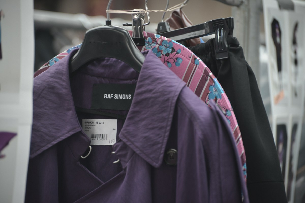
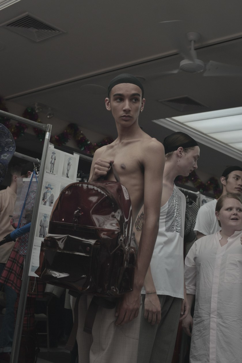
Set under the famous Manhattan bridge, a global landmark for the city that never sleeps. The Belgian born New York resident releases his latest collection on to a crowd of hungry fans including rapper A$AP Rocky and friend and fellow designer, Marc Jacob. The scene before the show is of his team adding buckets of water to the concrete paved floor and the fragrant concoction of fresh market fish and Chinese beer. Those lucky enough to have a ticket to the anticipates show wait in formation to form the runway as they stand opposite one another whilst they eagerly wait and guess to what may come out this time.
As the show begins we are greeted with a futuristic umbrella wielding model stepping out into the crowd of parted onlooker. A stand out piece from the collection would be the various umbrellas, with some having neon light encased handles whilst others have their fabric torn, adding a questionable opposition to its primary function against the elements.
The umbrellas and surrounding location however pay a direct reference to a scene from the 1982 classic, Blade Runner. In which a sea of umbrellas with illuminating handles weave between bustling hoards of people in an energetic China town. With traditional paper lanterns hanging between layered neon signs, they even find their way in to the hands of some models who show them off as if they were a bag or any other accessory.
Additional details to the lanterns and to some of the shows graphic tees in whatever state they found themselves in as they were walked down the runway, were courtesy of frequent collaborator, Peter Saville. The art director and graphic designer famously known for Joy Divisions ‘Unknown Pleasures’ album cover of radio waves and New Orders ‘Substance 1987’ album cover both found their way on to pieces in the collection.
The clothes themselves were made up from stimulating assortment of textured fabrics, from shiny vinyl rubbers that made up rain coats with some being embossed with a crocodile skin pattern and worn off the shoulder (see image 6 below). With signature pieces making their way into the show from his Fall 2016 menswear collection, in the form of extremely oversized knitted wool jumpers with distressed detailing (see image 9 below).
This slideshow requires JavaScript.
What I liked so much about this collection was its relatable functions to British weather, particularly in the spring time. A time in which we receive rain in the form of showers and downpours, the rain coats, wellies and umbrellas fulfil every aspect of practicality to what it means to live in the UK…I could maybe pass on the torn ones for obvious reasons. The gritty colour palette of the collection only enhances the moody character that each model adorns, with browns and greys being broken up with floral blues and mustard yellow. With the transition from Winter to Summer, the spring time overs a break in which combating temperatures range from cold winds to soothingly warm clear skies. The best solution is a knitted jumper due to its diverse durability of being breathable but protective if it needs to, the oversized pieces from the collection offers that in the most uniquely stylish way. The collection is undoubtably refreshing compared to the fragile florals appliqués and pastels we are usually provided and I for one look forward to seeing what Raf gives us in his next collection. But even though I’m a stereotypical university student living off his loan I will eagerly await the release of both a particular backpack and its (potentially manageable) price tag.
I can’t say I wasn’t intrigued after watching the Netflix original films teaser. With the 51 second clip casting a perception of light-hearted innocence which would soon be contrastingly opposed after watching the film itself. The teaser gave nothing away to the raw subject matter that the film tackled, one which is prevalent in today’s society and one that was questioned through, ‘Okja‘.
The unique name to a similarly unique creature, Okja is one of 26 super piglets which were reproduced through “non-forced natural mating” by the Miranda corporation. A company with a heritage based on slavery and suffering that has been passed down through three generations, until now as it falls into the hands of, Lucy Mirando. In an attempt to salvage the potential profits from her families remains, the blonde bobbed CEO announces a contest that in the end will bring a solution to world hunger. Spread over a 10 year period, the super piglets are raised under the traditional methods of a valued local farmer in 26 countries across the world . However in the end only one piglet can be the front-runner for the ways in which the future piglets will be raised and ultimately for slaughter.
Mija
The leading protagonist is that of young South Korean girl named Mija, who is the primary caretaker for Okja, one of the super piglets taking place in the competition. Based upon a hill in a rural part of Korea, the two enjoy the surrounding forests and rivers that run down it. With her grandfather being guardian to both Okja and herself, the fact that they both grew up alongside each other explains her desperate hopefulness to think that they can simply buy Okja out of the competition. However as the 10 year period draws to and end so does her time with her friend. In attempt to get her back she naively follows to New York and is swiftly promoted to the mascot of the closing competition. Determined to the very end she strives to save her friend but what does that mean if she can’t save any of the others.
Heebong
Mijas grandfather is one of the 26 esteemed farmers that Mirando chose to raise one of the super piglets at the start of the global contest. A traditional man who put little effort into raising the piglet in any way, he instead let her freely roam the land she lived on, eating what she wanted which included persimmon courtesy of Mija. Due to his laid back work ethic he never closely connected to the super pig, which shows when he carries on with his other chores immediately after Okja is taken from the home she has known for the past 10 years. His own carless ignorance towards his granddaughter is shown in his mindless attempt to buy her off with a solid gold pig in an attempt to replace the loss of her best friend in a matter of minutes.
Lucy Mirando
The deluded visionary behind the entire super pig competition and latest CEO to the companies predecessor is that of her twin sister, Lucy Mirando. The wannabe business hotshot is so transfixed on her ideas to save the companies ruined reputation, as well as her desperate craving to be more succesful than her sister, that she sees no emotional connection to her plans and the people she’s involved within them. By casting the family fun facade over the animalistic nature of the competition, she believes that she can win the population by giving them a sugar-coated solution to a global problem. Driven by her questionable motives that drive her forward, she still lacks a crucial trait for the world of business. That being self belief in her role as a leader.
Dr. Johnny Wilcox
The beloved zoologist, veterinarian and all out animal lover, Dr. Johnny Wilcox acts as the latest face for the Mirando corporation. Playing the role of the humorous presenter and judge to which super pig will be crowned the best at the end of the 10 year period. Once loved by both adults and children a like, his public interest along with his ratings become increasingly as washed out as his joke fueled career now is. A fame induced has-been, the off-screen drunk holds little to his name as he plays to the public eye. With the whiskey he had for lunch clouding his vision in to how Lucy is using his family friendly image to strengthen her own selfishly sinister agenda.
Jay
The rebellious leader of the animal-rights activist group ALF (Animal Liberation Front). Jay alongside his team of vegans and other animal lovers, free those imprisoned within zoos, labs and slaughterhouses. Doing so to set right the things so forcefully wrong, to those with the incapability to say beg or plead their rights. With his devoted team by his side their latest goal is to free Okja, as well as the hundreds of thousands of other super pigs held captive for breeding and ultimately slaughter. Possessing an equal level of determination as any one of the other characters, his drives him to spread the message of veganism as a right to all animals.
To me the most complex character was Lucy Mirando, played by actress Tilda Swinton, as we are first introduced to her in a sterile white lab coat inspired belted wrap dress, platinum blonde bob and an electric hot pink lipstick that frames her braced teeth. The next time we see her is amongst the devastating aftermath caused by the prize super pig and her friend back in Seoul city. Back in her New York office she examines her strategic options in a baby pink Chanel jacket from their Resort 2017 collection. With the over sized lapels of the clean-cut suit jacket displaying a subtle hint to the level of eccentricity her character embodies.
Tilda and director Bong Joon-ho
Chanel Resort 2017, Look 43
Throughout the film I was curious in to each outfit that Lucy adorned in the sparse but fulfilling scenes we were given. In total the three looks we were shown gave a clear profile to the sort of woman she is. A business woman who focuses on the micro details, her wardrobe expresses her need for success as well as her feminine distinction through her love for pink that separates her from her militant twin sister. I wouldn’t have known indefinitely that two of the outfits worn would be courtesy of the Parisian fashion house, Chanel if it weren’t for their bold feature into the films ending credits.
The stand out piece would have to be the custom-made Hanbok inspired dress, that was a replica to the one that closed the 95 piece show for the houses 2016 Resort collection. The original referenced the traditional Korean dress, with its voluminous skirt being cut at the ankle as well as being cinched in around the chest. The pale pink skirt, separated by a velvet green bow to a sleeve and collar cut in a translucent silk, matches that of her fair skin. As well as it just translating her characters wealth and distinctive taste, it also pays respectable tribute to the winning farmer and her heritage.
One of the must see films of this year, it comes to no surprise why this filmed received a four-minute standing ovation at its debut at Cannes just a few months ago. A distinctive film that brings to light an important topic in today’s climate, it truly does make you question what we as humans consume on a day-to-day basis. All thanks to the empathetic and loveable super pig, Okja.
 The CBC Arts video followed the creative process of artist Callen Schaub, in the confined proximity of his paint covered studio. As before the free-flowing and one-sided interview even starts we see vivid paints bouncing off and finding home not only on the canvas but also the once white walls. The quick introduction to one of, if not the most distinctive techniques he owns in his work is certainly interesting to say the least. As the rotations quickly transform any one of his pieces into a self-titled display of organic art. With each one of his pieces embodying a unique character, mood and overall emotion if it be through colour, shape or unintentional reference. But what I like most about his canvas based work is how the abstract forms will translate so differently to any viewer, if it be a blazing oil spill, butterfly’s wing or a hybrid selection of two exotic birds that I immediately saw.


 I had been looking forward to the latest release from esteemed director, Luc Besson for what seemed like a never-ending wait over the course of what was only a few months. His most recent film mostly commonly referred to as Valerian, adds to extensive and highly admired body of work , made up of over 50 films to date. With his most well-known being the ‘Taken’ franchise, ‘The Fifth Element’ and ‘Lucy’. It begs no great surprise that I would have been so enveloped and eager for its approaching release the first trailer I saw, as his 1997 sic-fi classic ‘The Fifth Element’ is one of my all time favourites. The similar core theme of creatively stimulating visuals and unexplainable vision through one persons eyes had me hooked and counting down the days till I could see it for myself.


 What I enjoy most is physically buying the magazine ive been searching for in person. Having to resort to order it online only if I have to due to it being a rare issue or if I can’t actually find it in a store. One of my other favourite shops to visit can be found in the heart of the urban jungle that is Manchester. The glossy red front of

 I am left puzzled when learning in conversation that a fellow classmate hasn’t delved themselves into what SHOWstudios has to offer. Even thought it comes as a questionable surprise to me personally, I quickly learnt that this lack of knowledge boils down to the two dominating intentions many have. The two types of people ive come across on the course reflects itself in the duality of the title itself. Those interested in the business and marketing side of the course are reflected in the ‘Promotion’ aspect. Whereas those who have a deeper interest and affiliation to fashion itself are more so drawn to and kept under the umbrella of the ‘Communication’ side. Either way which ever side someone predominantly leans towards, gaining a further understanding of the industry itself in terms of the runway shows and the history behind the designers, houses, collections and any one of the numerous creatives that lend their talents in some way will defiantly benefit them in the long-run.


 Having just spent a week in the City, a whole 7 days were filled with the freedom to explore what I had yet to see. The time in which I chose to visit couldn’t have worked out any better either. Whilst watching once of the recent panel discussions from Show Studios, the leading host Lou Stoppard mentioned a newly opened exhibition in the City as they discussed the latest collection from Raf Simons. The exhibition in question is a celebration for the famous art director, Peter Saville. The respected graphic designer and the one responsible for creating the iconic jacket covers for the band Joy Division. Held in his hometown, the curated exhibition featured his work with musicians through album covers, posters and also his most notable collaborations into the fashion industry.


 Even though my goal was to see the coats for myself, as I explored the room it was hard not to look onto his other work without admiration. A cased wall displayed a selection of his most famous album cover work, from simple typographic based pieces to contrasting flame covered beach scenes. Another feature of the room was that of a large white block installation which was impressive just for its sheer size and simplicity. The connecting blocks had single detail of typography plastered on each side of the cubes, words included “ACDC”, “JOY DIVISION”, and “Love will tear us apart”, all of which reference his collaborations and career.
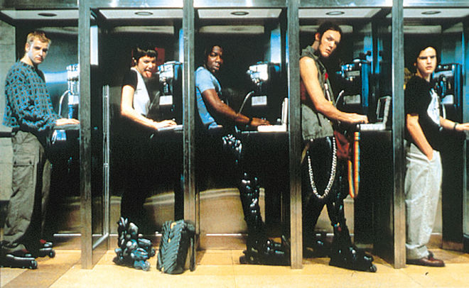
 The first time I watched this film I instantly was transfixed by one thing in particular, the fashion. It was hard not to look at each piece the characters wore as quickly as you could, simply because what they wear is something we don’t see on the streets today. With it being set in the mid 90s a lot passed within certain boundaries that just isn’t now. In a time heavily influence by music, both grunge and rave attire was incredibly popular amongst teens and young adults. With staple pieces such as orange lined bombers, harness like belts and skin-tight long-sleeved t-shirts being adorned by men and women alike, thanks to the late trendsetter Gianna Versace.


 Having been a fan ever since their debut near enough this time last year, I was eagerly waiting for their first comeback of 2017. With it being an overdue 8 months since their last release, it’s no surprise that I counted down the minutes till this one finally dropped. Having only been fed teaser pictures of each member, along with a cruelly short 20 second teaser that left only more questions than before. Opening with a similar aesthetic to their first duo debut hits ‘Whistle’ and ‘Boombayah’, through a heavy use of bright colours and neon lighting. The thing that felt immediately different to their previous work was the music itself being played over the top, as evidently thick electro-pop sounds play alongside a newly introduced heightened tempo. Unlike their other record-breaking releases, this one quickly distinguished itself as a fresh new sound for the beloved rookies.